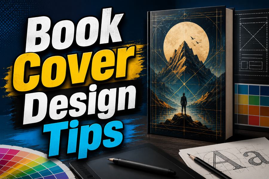
Book cover design tips matter because readers judge your book before they read a single page. It has to show genre, mood, quality, and promise in seconds. The best covers work like packaging, not decoration.
A strong cover does not explain the whole story. It gives the right reader enough clarity to stop, click, and feel curious. Use these steps to make it clearer and easier to sell.
Understand The Job Of A Book Cover
Your cover has one main job: help the right reader recognize the right book. Pew reported in 2025 that 75% of U.S. adults read a book in any format, while 64% read print books, 31% read e-books, and 26% listened to audiobooks. One small image may reach them all.
Start with one promise. A thriller promises tension, a romance promises emotion, and a business book promises a useful result. Authors who want a practical production tool can create KDP books, covers and publishing assets faster when cover work connects with formatting and launch assets.
Must-know Tip: A professional cover does not show everything. It chooses one clear buying signal and makes that signal easy to understand.
Research Your Genre Before Designing
Do not design in isolation. Save 15 to 25 successful covers in your exact subgenre. Study title size, color, image style, and tone.
This research protects you from being different in the wrong way. Readers use genre signals to decide what feels trustworthy. You can stand out, but you still need to belong.
Print sales show why clarity matters. Publishers Weekly reported that U.S. print book unit sales reached 762.4 million in 2025, up 0.3% from 2024, and 2024 sales were up 0.5% from 2023. Readers need to understand your category before they admire your creativity.
Choose One Clear Visual Idea
A weak cover tries to show the full plot. A strong cover chooses one clear image, symbol, person, place, or mood. That focus helps the reader react faster.
Think of your cover as a poster seen from across a room. If someone cannot explain it in one short sentence, the design may be too busy. Remove anything that does not support the main promise.
Online shopping makes this important. The Census Bureau reported that U.S. retail e-commerce sales reached $302.3 billion in the first quarter of 2026, increased 9.7% from the first quarter of 2025, and made up 16.8% of total retail sales. Clutter loses attention on fast digital shelves.
Make Typography Readable First
Typography can make a simple cover look premium. It can also cheapen a strong image. Your title must be readable first, then stylish.
Use one strong display font for the title and one clean support font for the subtitle or author name. Avoid three or four typefaces unless you have a clear reason. Many amateur covers fail because the fonts fight.
Mobile buying raises the stakes. EMARKETER projected that U.S. retail mobile commerce would reach $542.73 billion in 2024 and represent 44.6% of U.S. retail e-commerce. Thin letters and low contrast disappear on phones.
Use Color To Signal Mood
Color tells readers how to feel before they read the description. Red may suggest danger, passion, urgency, or violence. Blue may suggest trust, calm, distance, mystery, or authority.
Choose colors for your reader, not your taste. Each genre uses a different emotional palette. One main color, one support color, and one accent color usually work better than many competing tones.
Test the cover in grayscale. If contrast works without color, it will usually perform better. If it turns flat, adjust contrast or title weight.
Design For Thumbnail Clicks
Many authors design too large. They judge it on a desktop screen, but buyers often see a tiny version first. Test thumbnails before final approval.
Shrink the cover to about 100 pixels wide. Check whether title, image, and mood still show. If the cover becomes muddy, enlarge the title, remove detail, or increase contrast.
The Association of American Publishers reported total U.S. publishing revenue of $32.5 billion in 2024. It also reported digital audio revenue up 22.5% to $2.4 billion and ebook revenue up 1.5% to $2.1 billion. Your cover must perform as a small clickable ad.
Must-know Tip: If your cover fails at thumbnail size, it is not finished. Fix readability before polishing effects.
Plan Ebook And Print Covers Separately
An ebook cover is usually only the front image. A print cover includes front, spine, back, barcode area, bleed, trim, and safe margins. Treating both formats the same creates problems.
Amazon KDP recommends Kindle cover dimensions of 2,560 pixels high by 1,600 pixels wide. KDP also lists 300 DPI/PPI minimum resolution, JPEG as the preferred file format, and a maximum file size of 5MB. These rules help your cover stay sharp.
Print files need different rules. IngramSpark’s guide lists 300 ppi, CMYK color, PDF cover files, and 0.125-inch bleed for many covers. It also warns you to keep text away from trim edges.
Create A Cover Design Brief
A design brief keeps the cover focused. It helps you avoid random choices and gives better direction. Without one, you will test ideas that do not match the reader.
Include the title, subtitle, author name, genre, subgenre, target reader, tone, key promise, comparable books, trim size, format needs, and deadline. Add three mood words, such as haunting, hopeful, fast, scholarly, dark, warm, or playful. These words guide decisions.
The U.S. self-publishing market was valued at $3.6 billion in 2025 and is projected to reach $3.9 billion in 2026, according to Grand View Research. More competition means your cover must look planned, not rushed.
Test Your Cover Before Publishing
Do not publish only because you like the design. Test it with readers who buy your genre. Genre readers are more useful than polite friends.
Ask direct questions:
• What genre do you think this is?
• What emotion do you feel first?
• Would you click this beside similar books?
• What looks confusing or unprofessional?
Do not ask which version is prettier. Ask which version feels clearer and more clickable. If several readers guess the wrong genre, the cover is unclear, not clever.
Must-know Tip: Good feedback protects your launch. It shows whether the cover communicates to real readers, not only to the author who already knows the story.
Use AI Carefully
AI can help you brainstorm concepts, backgrounds, mood boards, and visual directions. It can also produce generic or risky covers. Use it as a draft partner, not a final designer.
Check every AI image closely. Look for strange hands, fake text, odd lighting, and repeated textures. Readers often feel when a cover looks cheap.
Licensing matters. Before using AI art commercially, review tool terms and platform rules. When in doubt, use licensed stock, custom illustration, original photography, or a professional designer.
Avoid Common Cover Mistakes
Most cover mistakes come from overloading the design. New authors often add too many images, fonts, and effects. The cover starts to look like a collage.
Avoid tiny title text, weak contrast, busy backgrounds, poor font pairing, ignored margins, and misleading genre signals. A horror-style romance cover may get clicks, but it will disappoint readers. A cover should attract the right reader and set the right expectation.
Good design builds trust. When the cover matches the promise, readers feel guided. That trust supports better clicks and stronger branding.
Build A Long-Term Author Brand
A single cover sells one book, but a cover system sells your author brand. This matters for series, nonfiction lines, and pen names. Readers should recognize related books fast.
Repeat useful design elements. You can reuse title placement, author-name style, color rhythm, borders, symbols, or image treatment. Covers can differ, but they should feel connected.
Brand consistency supports memory. A reader may remember the style later. A cover system looks professional across stores, ads, and websites.
Final Book Cover Checklist
Before publishing, review the cover like a buyer. Do not review it as the author. Review it as a first-time buyer.
Use this checklist:
• The genre is clear in seconds
• The title works at small size
• The focal image is simple
• The colors match the mood
• The ebook file meets platform rules
• The print file has proper bleed
• Genre readers gave feedback
• The design matches your author brand
Strong covers often come from removal. Remove weak details, extra fonts, decorative clutter, and unclear symbols. What remains should feel clear and confident.
Conclusion
Book cover design tips help when you use them as a complete publishing system, not random decoration advice. Your cover should show the right genre, promise the right experience, and build trust before anyone reads the description. Start with market research, choose one strong visual idea, build readable typography, use color with purpose, and test the design at thumbnail size.
Prepare separate ebook and print files so the cover looks sharp everywhere. The best cover does not need to impress everyone. It needs to attract the right readers, match the promise, and support your brand. When you design with that goal, your cover becomes a serious marketing asset.
FAQs About Book Cover Design Tips
What Makes A Good Book Cover Design?
A good book cover clearly shows the genre, mood, and promise of the book. It uses readable type, strong contrast, and one focused visual idea.
How Do Beginners Design A Book Cover?
Start with genre research, then write a simple design brief. Choose one strong image, readable fonts, and a focused color palette.
What Should Be On A Book Cover?
A front cover needs the title, author name, and a strong visual style. A print cover also needs a spine, back cover, barcode space, bleed, and safe margins.
How Many Fonts Should A Book Cover Use?
Most covers should use one title font and one supporting font. More fonts can make the design look messy.
What Is The Best Ebook Cover Size?
Amazon KDP recommends 2,560 pixels high by 1,600 pixels wide. Keep the file sharp, readable, and correctly compressed.
Should I Use A Character On My Cover?
Use a character if it fits your genre and helps readers understand the book faster. Avoid character art if it makes the cover crowded.
How Do I Know If My Cover Fits My Genre?
Compare it with top books in your category. If readers can guess the genre quickly, your design is moving in the right direction.
Can I Use AI For Book Cover Design?
You can use AI for ideas and draft visuals. Always check quality, licensing, platform rules, and commercial-use rights before publishing.
Why Is Thumbnail Testing Important?
Thumbnail testing shows whether the cover works at small size. If the title and mood disappear, revise the design before launch.
Should I Hire A Professional Cover Designer?
Hire a designer if you lack design skill or want a serious launch. A professional can improve typography, market fit, print setup, and polish.